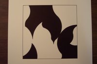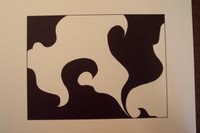


Okay, the second round of art-related posts. These are three designs that I did for my 2D Design class that were shape-based, but that's only half the assignment: the challenge of these pieces was to have a complex figure-ground relationship between the black and white shapes so that it looked like there was no figure and no ground, meaning that your eyes would shift back and forth equally between seeing the black shapes and the white shapes. Does that make any sense the way I've described it?
The whole point of these drawings is that the white does not overwhelm the black and the black does not overwhelm the white. Any combination of the white shapes in the composition should be equally as intersting and engaging as any combination of the black shapes. If that doesn't help, then I'm not sure how else to tell you about the assignment... I didn't really understand it in writing myself, but I think I got the hang of it once I started working.
This assignment included three versions of the same principle: a curviliniar design, an angular design, and an organic design.

No comments:
Post a Comment